

| Responsive | Adaptive |
| What is Responsive Web Design? Responsive Web Design is about using HTML and CSS to automatically resize, hide, shrink, or enlarge, a website, to make it look good on all devices (desktops, tablets, and phones). | What is Adaptive Web Design?Adaptive Web Design ensures a site displays correctly on devices with different screen sizes, providing a convenient and user-friendly experience without the need to zoom or adjust areas for navigation. |
| Difference Responsive websites use a flexible structure, where element sizes are set in percentages. As the page width changes, content smoothly adapts, like turning three columns into one or two on narrower screens. | Difference Adaptive websites may resemble responsive ones, but the key difference is that they use pre-defined layouts for different screen widths and device types, offering specific versions tailored for each device. |
| Example 1. Media queries 2. Flexible nets 3. Multicol 4. Flexbox 5. Responding to typography 6. My page design using Responsive https://dariahalchenko23.thkit.ee/valimus.html | Example 1. Adaptive Layout |
Example of Response
1. Media queries
@media screen and (min-width: 800px)
{
   .container {
          margin: 1em 2em;
     }
}
body {
background-color: lightpink;
}
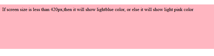
@media screen and (max-width: 420px) {
body {
background-color: lightblue;
}
}
It will produce the following result −
2. Flexible nets
.col {
    width: 6.25%; /* 60 / 960 = 0.0625 */
}
3. Multicol
.container {
    column-count: 3;
}
.container {
   column-width: 10em;
}
4. Flexbox
.container {
   display: flex;
}
.item {
   flex: 1;
}
5. Responding to Typography
Edited the example of a feedback grid grid so that it also included an adaptive type using the described method of feedback typography. You can see the title changing dimensions when the model turns into a two-column version.
html {
      font-size: 1em;
}
h1 {
      font-size: 2rem;
}
@media (min-width: 1200px) {
 h1 {
      font-size: 4rem;
      }
}
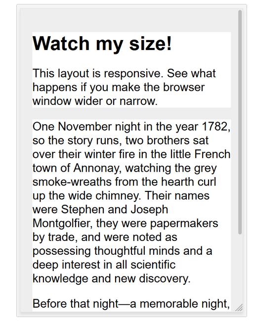
In mobile versions, the title is less:
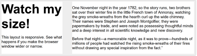
On the computers, however, we see a bigger headline:
CSS – Responsive
body {
            font: 600 14px/24px "Open Sans",
               "HelveticaNeue-Light",
               "Helvetica Neue Light",
               "Helvetica Neue",
               Helvetica, Arial,
               "Lucida Grande",
               Sans-Serif;
         }
         h1 {
            color: #9799a7;
            font-size: 14px;
            font-weight: bold;
            margin-bottom: 6px;
         }
         .container:before, .container:after {
            content: "";
            display: table;
         }
         .container:after {
            clear: both;
         }
         .container {
            background: #eaeaed;
            margin-bottom: 24px;
            *zoom: 1;
         }
         .container-75 {
            width: 75%;
         }
         .container-50 {
            margin-bottom: 0;
            width: 50%;
         }
         .container, section, aside {
            border-radius: 6px;
         }
         section, aside {
            background: #2db34a;
            color: #fff;
            margin: 1.858736059%;
            padding: 20px 0;
            text-align: center;
         }
         section {
            float: left;
            width: 63.197026%;
         }
         aside {
            float: right;
            width: 29.3680297%;
         }
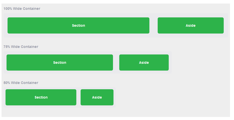
It will produce the following result −
Example of Adaptive
body {
    font-family: Arial, sans-serif;
    margin: 0;
    padding: 0;
    line-height: 1.6;
}

header, footer {
    text-align: center;
    background-color: #87CEFA; /* LightBlue */
    color: black;
    padding: 1rem;
    border: 2px solid #FF69B4; /* HotPink */
}

nav ul {
    display: flex;
    justify-content: center;
    list-style-type: none;
    background-color: #DB7093; /* PaleVioletRed */
    margin: 0;
    padding: 0;
}

nav ul li {
    margin: 0;
}

nav ul li a {
    text-decoration: none;
    color: white;
    padding: 10px 20px;
    display: block;
}

nav ul li a:hover {
    background-color: #FFC0CB; /* Pink */
}

main {
    display: flex;
    justify-content: space-around;
    flex-wrap: wrap;
    padding: 20px;
}

section {
    background-color: #FFF0F5; /* LavenderBlush */
    border: 2px solid #FF69B4; /* HotPink */
    border-radius: 10px;
    padding: 10px;
    width: 30%;
    margin: 10px;
    text-align: center;
}
@media (max-width: 768px) {
    nav ul {
        flex-direction: column;
        align-items: center;
    }

    section {
        width: 45%;
    }
}
@media (max-width: 480px) {
    header, footer {
        font-size: 14px;
    }

    nav ul li a {
        padding: 8px;
        font-size: 14px;
    }

    section {
        width: 90%;
        margin: 10px auto;
    }

    body {
        padding: 10px;
    }
}
1. Adaptive Layout
The adaptation scheme allows dynamic changes to the elements of the site (figure, location, colour, etc.). Depending on the size of the screen, using media requests (@media). For example, for devices with a screen width of less than 1200px, the width of 960px is set, while for devices with a width of less than 480px, other parameters are set.
@media all and (max-width: 1200px) {
     div {
          width: 960px;
     }
}
@media all and (max-width: 480px) {
     div {
          width: 320px;
     }
}
Summary
Responsive web design makes the site comfortable and beautiful on any device. This design is easier to maintain, it is better indexed by search engines, saves resources, simplifies content management, and increases the flexibility of the site. Responsive web design is universal and